
Context
Putting savings inside an e-wallet did not automatically change how users understood the money
The product made a savings account easier to access from AstraPay. The harder problem was not whether users could find it, but whether they understood that the money served a different purpose from the normal wallet balance.
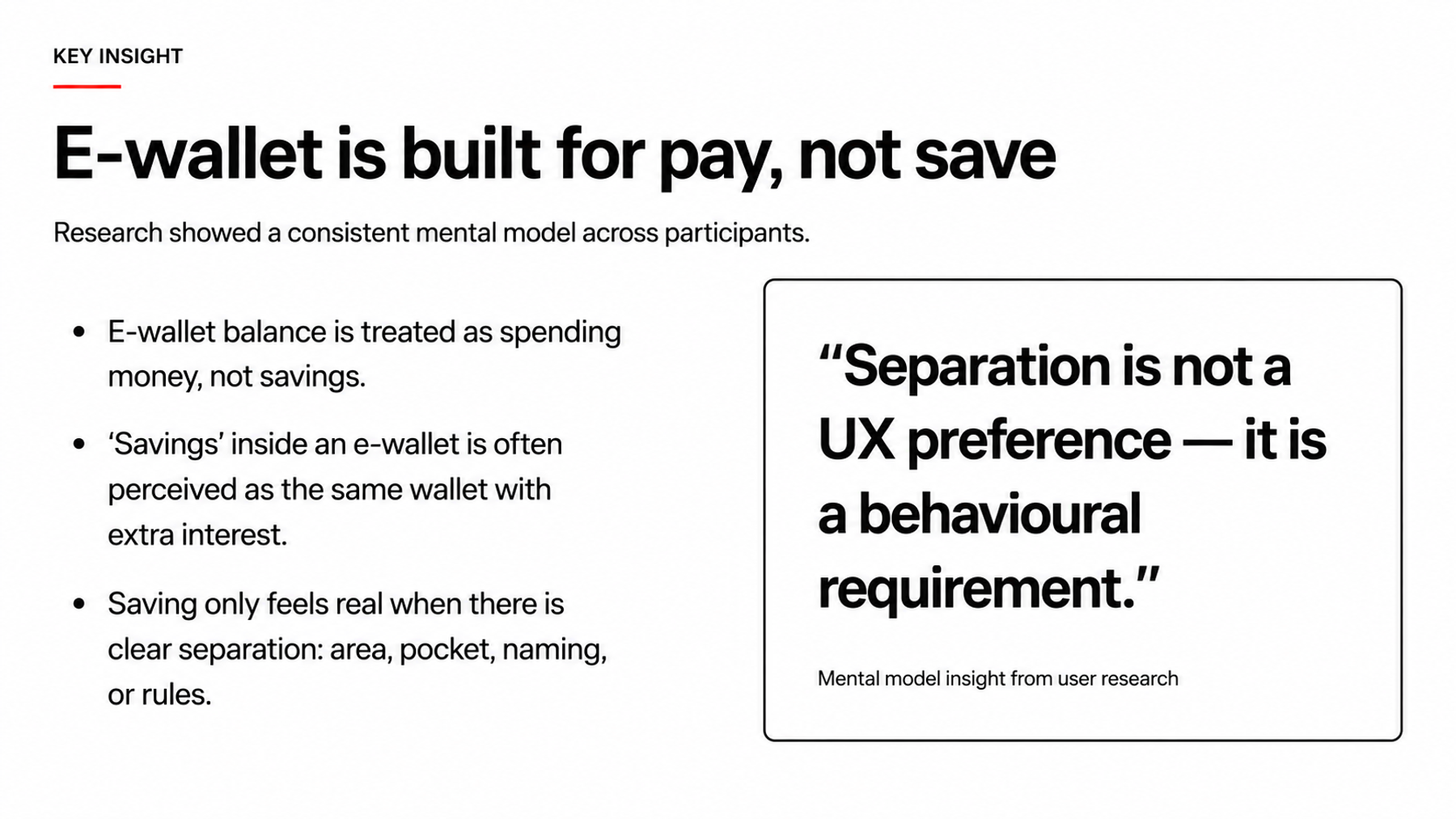
Research showed that e-wallet balance already had a strong mental model as money for everyday transactions. If the savings product sat too close to the main balance, benefits such as interest could easily feel like an extra feature of the same wallet.
That changed the design question. The challenge was not how to make savings look more attractive, but how to keep two kinds of money easy to access from one ecosystem without collapsing their roles into one.
The product needed to stay connected to AstraPay while remaining distinct enough to create a separate mental account.
Research readout
Three findings changed the product direction most
These were not cosmetic preferences. Each finding affected how the product needed to sit inside the wallet.
Research and benchmark
The evidence behind the positioning
These three artifacts show the starting mental model, the cues that made savings feel more real, and how similar products were positioned in the market.
Wallet balance was still spending money
The e-wallet context shaped interpretation before users read the new product explanation.
Positioning decision
The challenge was separation without making the product feel disconnected
The product still needed to feel easy to access from AstraPay, but it could not collapse into one undifferentiated pool of balance.
Too integrated
A wallet with extra benefits
If the balance, hierarchy, and identity look too similar to the main wallet, users have little reason to treat it as money with another purpose.
Access feels simple, but the financial proposition becomes weaker.Separate but connected
Two balances with two money roles
The linked savings product remains part of the AstraPay ecosystem while a distinct balance and hierarchy help users form a separate mental account.
The distinction starts in product structure before copy explains it.Product structure
The positioning had to be legible in the product architecture
One AstraPay entry point could expose two balances with different jobs. The linked savings balance remained connected to an account at the partner bank without needing to look like part of the same wallet balance.
Entry
AstraPayOne ecosystem and entry point for the user
Spend
Wallet balanceMoney for everyday transactions
Save
Linked savings balanceA separate balance with another financial role
Use
Everyday transactionsPayments and familiar wallet usage
Bank layer
Partner-bank savings accountThe underlying account remains connected to the AstraPay experience
Flow connections
- astrapay-home to wallet-balance
- astrapay-home to savings-balance
- wallet-balance to daily-use
- savings-balance to partner-account
This diagram shows the relationship users needed to understand, not backend implementation detail.
Positioning boundary
We deliberately avoided selling capabilities the product did not have
The product did not yet include saving goals, automated saving, budgeting, or deeper money-management tools. Framing it like a dedicated saving system would create a promise larger than the experience could support.
I pushed for a more precise position. The product should give users a different place for their money, remain easy to access from AstraPay, and communicate the financial value that already existed.
That boundary also helped when evaluating naming, hierarchy, and visual directions. Each decision needed to clarify the product role without adding a promise the experience could not yet deliver.
Product principles
Research became four working principles
These principles gave product, design, and the partner team a shared set of criteria for later decisions.
From positioning to interface
If users need a long explanation to see the difference, the hierarchy is not doing enough
Naming and copy still help, but they should explain a distinction that is already visible in the product structure.
Copy-led
Explain that this is a savings product
Useful during onboarding, but fragile if both balances still look like one pool of money.
Understanding depends too heavily on users reading.Structure-led
Make the money roles visible first
Balance hierarchy, naming, and product identity work together so users can distinguish wallet money from linked savings before reading detail.
Copy then adds context to a difference the interface already makes visible.Joint branding workshop
We discussed the logo after we had a reason for how the product should sit in the ecosystem
I brought the research and competitor benchmark into a workshop with the partner team. The discussion started with the relationship between AstraPay, the partner brand, and the product inside one experience rather than with logo shapes.
The positioning became a criterion for evaluating brand hierarchy and visual directions. A direction too close to the wallet could weaken separation, while one that felt too independent could break the relationship with the ecosystem and the partner behind the product.
The shortlisted directions then moved into partner and leadership review with reasoning tied back to the user mental model and product capability.
The visual direction was not a standalone output. It needed to help users understand where the product belonged.
Outcome
Research became decision criteria for both product and brand
This project did not produce a conversion number that should be used as a headline. Its most useful output was a clearer product position and a set of criteria that product, design, and the partner team could use together.
Wallet balance and linked savings still needed to be easy to find in AstraPay, but they could not read as money with the same job. That principle became input for product framing, interface hierarchy, branding architecture, and later visual directions.
For the next validation, I would measure whether users can distinguish the purpose of the two balances without a long explanation, then check whether that understanding holds when they begin activating and using the product.