Planned top up
Follow account or payment details
The user deliberately opens a bank, Virtual Account, or OTC route and completes the steps required by that channel.
Useful when the transaction is planned. Not just screens. System, behavior, and outcomes
AstraPay needed a top-up flow for moments when another person was physically present to fund the balance. I adapted a familiar QRIS payment pattern, designed the happy path and transaction states with engineering, and kept the user flow short. By 2026, QRIS Top Up represented 9.3% of cash-in and ranked among the top two channels.
AstraPay already supported Virtual Account, bank transfer, and OTC top ups. Those methods worked when people planned the transaction and had time to open another channel.
The gap was a more immediate situation. Someone needed AstraPay balance and another person nearby was ready to fund it. Looking up or sharing account details made that moment slower than it needed to be.
I turned that brief into the interaction model, worked through the transaction states with engineering, and carried the feature into a flow that could sit inside the existing Top Up area.
The useful question was not how to add another payment method. It was how to remove account-detail exchange from a top up between two people who were already together.
I separated a planned cash-in from a nearby person-to-person cash-in before deciding on the interaction.
The user deliberately opens a bank, Virtual Account, or OTC route and completes the steps required by that channel.
Useful when the transaction is planned.The person funding the balance is already present. A generated QR removes the need to exchange an account identifier.
The interaction is built around proximity.Try the flowThe early concept focused on removing number entry. Engineering alignment then mapped what had to happen after the QR was shown.
The concept adapted a familiar QRIS presentation pattern to cash-in. The AstraPay user presents the QR and the funding person scans it.
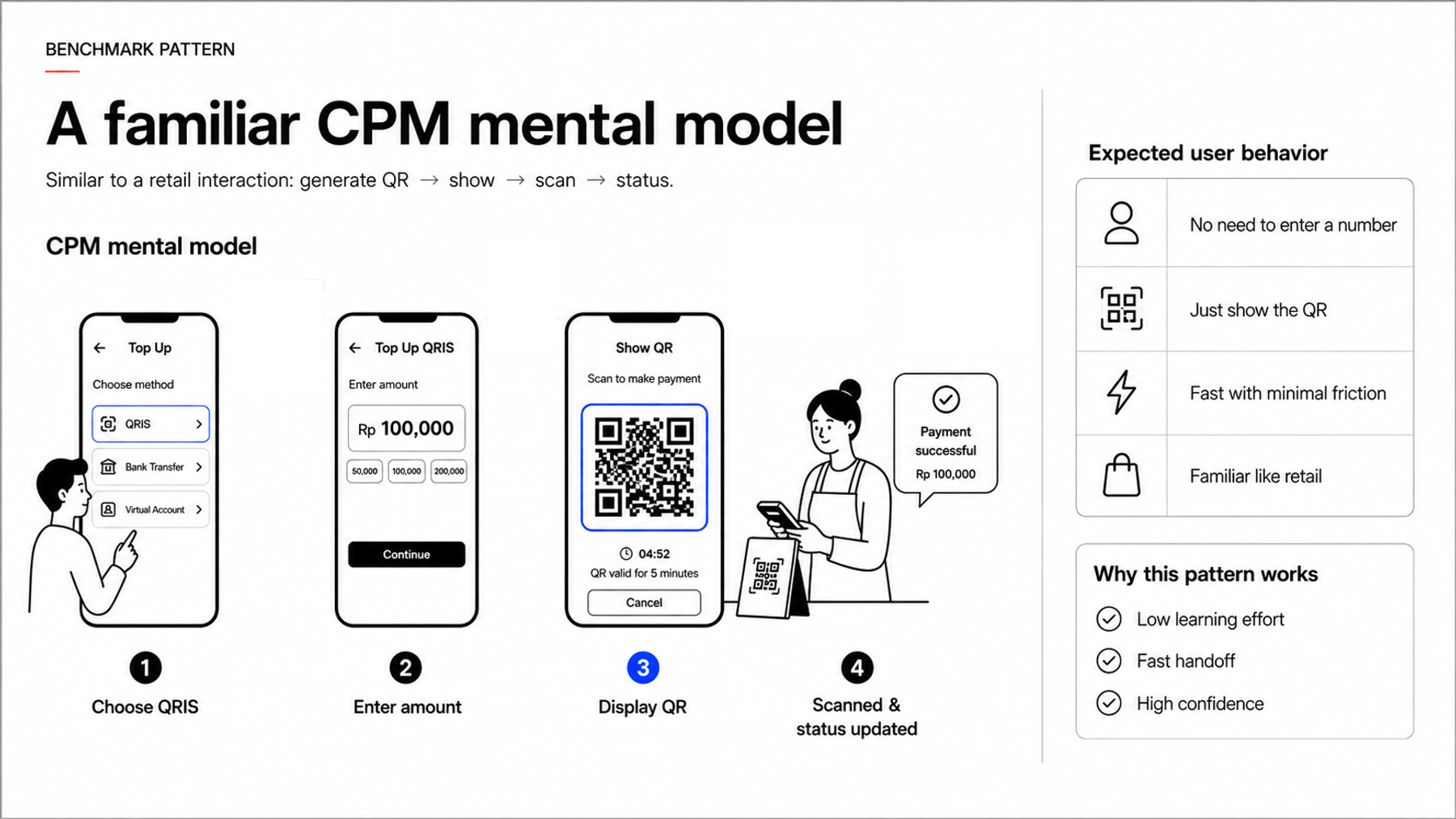
Merchant-presented QRIS already had a familiar rhythm. One side shows a QR, the other side scans and pays. QRIS Top Up reused that behavior while changing where the money ended up.
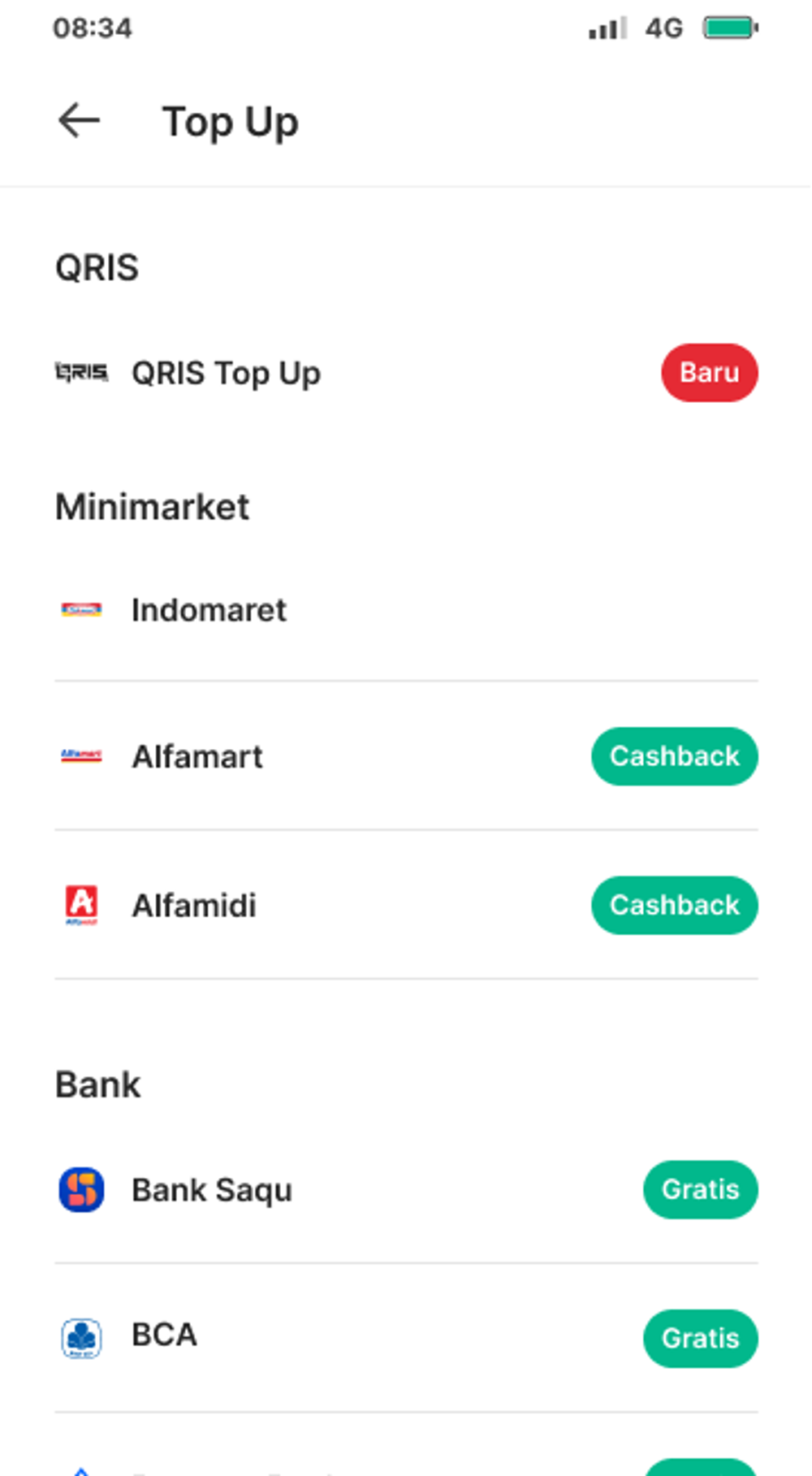
The user flow could therefore stay inside the existing Top Up area. Choose QRIS, set the amount, show the QR, wait for payment, then show the resolved state.
The interaction did not need a new navigation model. Most of the design work moved into what happened while the payment was waiting or when the result was not immediately clear.
Follow the main top-up path, then inspect the expiry and recovery states that sit outside the happy path.
This state model shows when the interface can wait, confirm success, close an expired bill, or recheck an unresolved transaction.
The amount is tied to a single top-up transaction.
The funding person scans the generated QR.
The UI stays pending while the bill is unresolved.
Bill status or callback updates the same transaction.
Success appears only after payment resolves.
Do not ask the user to pay again yet.
The old QR is no longer reused.
Recovery checks the existing transaction first.
A fresh transaction starts after the old bill is closed.
Flow connections
The diagram stays at product-state level. It shows the transaction behavior needed by the experience without exposing implementation detail that is not necessary for the case.
These rules were used to translate backend transaction behavior into user-facing states.
The strongest post-launch evidence is the channel contribution recorded in 2026.
The chart shows the documented channel share rather than an invented transaction funnel.
A feature designed for a specific nearby top-up moment grew into one of AstraPay's largest cash-in channels.
| Label | QRIS Top Up | Other cash-in |
|---|---|---|
| 2026 cash-in mix | 9.3% | 90.7% |
The 9.3% QRIS Top Up share is measured. The 90.7% remainder is derived from that figure. This chart describes channel composition and does not claim incremental lift caused by the feature.
The useful design move was not adding more steps. It was applying an interaction people already understood to a different cash-in moment.
The part that needed more care was transaction truth. Waiting, success, expiry, and recovery had to remain understandable to users while staying aligned with the payment state underneath.